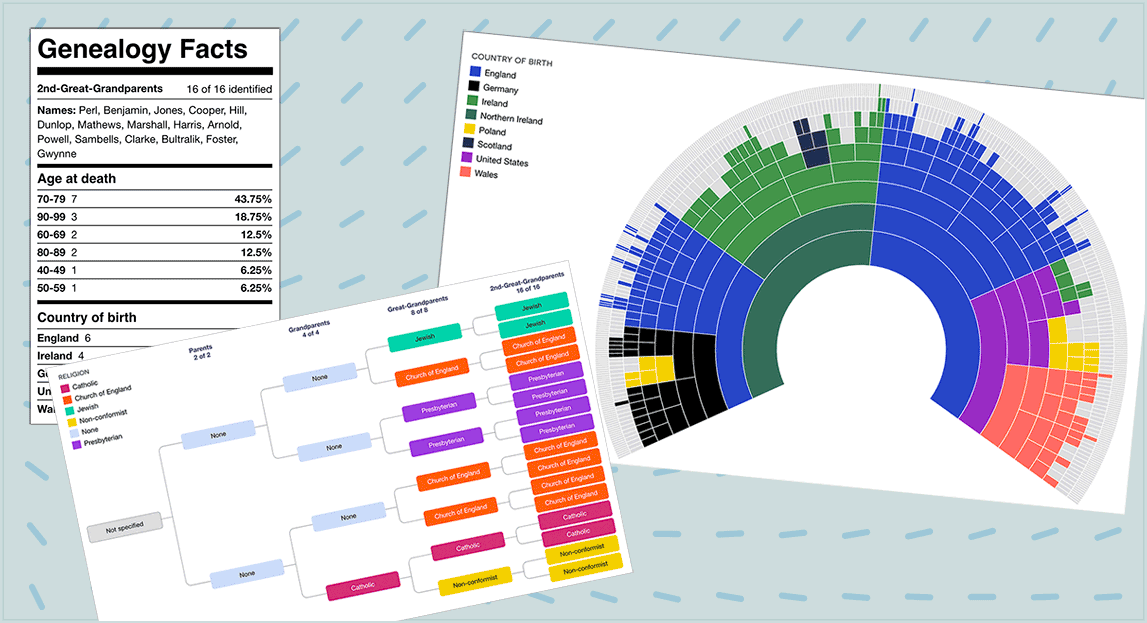
I am pleased to announce the launch of dimensions, a new feature within ancestral trees at DNA Painter. Ancestral trees allow you to extract and visualise your direct line in a tree, fan chart and text pedigree, all within one searchable page. For more background on ancestral trees, please visit my previous blog post.
DNA Painter Dimensions
DNA Painter Dimensions are custom categories allowing you to create and share different views of your direct line.
Some example dimensions are religion, country or region of birth, but you are not restricted to these. This type of colour coding can make for some compelling visualisations.
The following examples were generated automatically from my imported family tree. I’ll link to some examples below so you can interact with dimensions more closely.
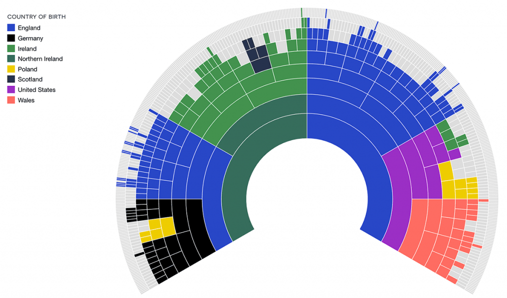
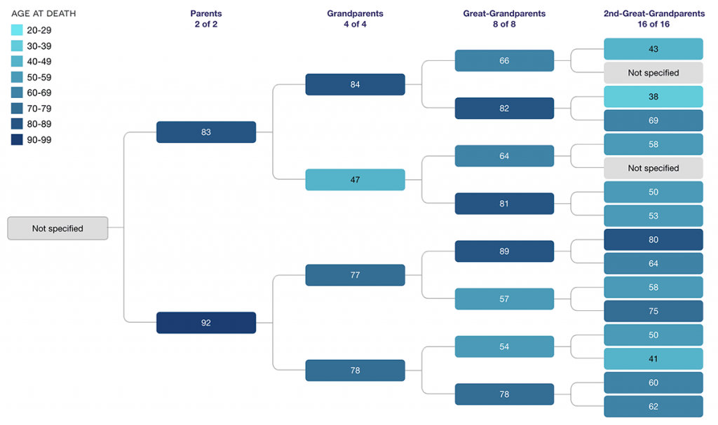
I released this feature quietly for subscribers a few weeks ago and am now pleased to be able to make it accessible to everyone. One user had a great suggestion that I was able to implement: an automatic dimension for ‘age at death’:
Accessing DNA Painter Dimensions
All registered DNA Painter users can now create one dimension. Subscribers can create up to five dimensions in each tree.
Adding dimensions
You can add dimensions manually, or alternatively a range of automatic dimensions can be derived from your tree.
First, click into your tree. If you’re creating a new tree, you’ll want to populate it with your ancestors–either manually or via importing a GEDCOM–before proceeding. You’ll see a link to ‘Dimensions’ at the top, with a dropdown menu.

After you click ‘Add/edit dimensions’ you’ll see an overlay inviting you to generate an automated dimension or add a new custom dimension.
Automated dimensions
DNA Painter can delve into your tree and generate the following dimensions, some of which are illustrated above:
- Age at death
- Where applicable, this extracts the person’s age at death from ‘Birth date’ and ‘Death date’
- Country of birth
- Uses information from ‘Birth place’ to extract countries
- Century of birth
- Extracts the century each person was born from the ‘Birth date’ field.
Since these are free text fields, some manual correction may be needed afterwards, particularly for the “Country of birth” dimension. Where the data does not explicitly name a country, the site will attempt to identify it anyway.
In addition, the site can add a predefined category to help you log your research: six levels of ancestral profiles for Yvette Hoitink’s level-up challenge (see Yvette’s blog post)
Manual
You don’t need to restrict yourself to what can be automated. Perhaps your ancestral background is predominantly from one country and you’d like to focus on regions or towns rather than countries. Perhaps you have specific facts to record that relate to your DNA research. Or perhaps you’re interested in cataloguing the cause of death or religion of your ancestors.
Creating dimensions manually is quite straightforward and efficient, thanks to a checkbox that allows you optionally to propagate values to all ancestors of the person you’re editing.
1. Create the dimension.
Within the “Add/edit dimensions” overlay, you’ll see a link “add new custom dimension” below the automated dimensions:
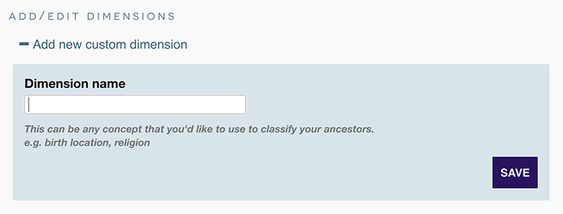
Once you’ve entered a name (for example, “Religion”) for your dimension and saved it, the dimension will appear in the edit form for everyone in your tree. You can optionally create some ‘starter’ values in advance.
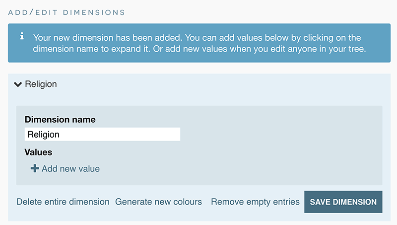
2. Add values to the people in your tree
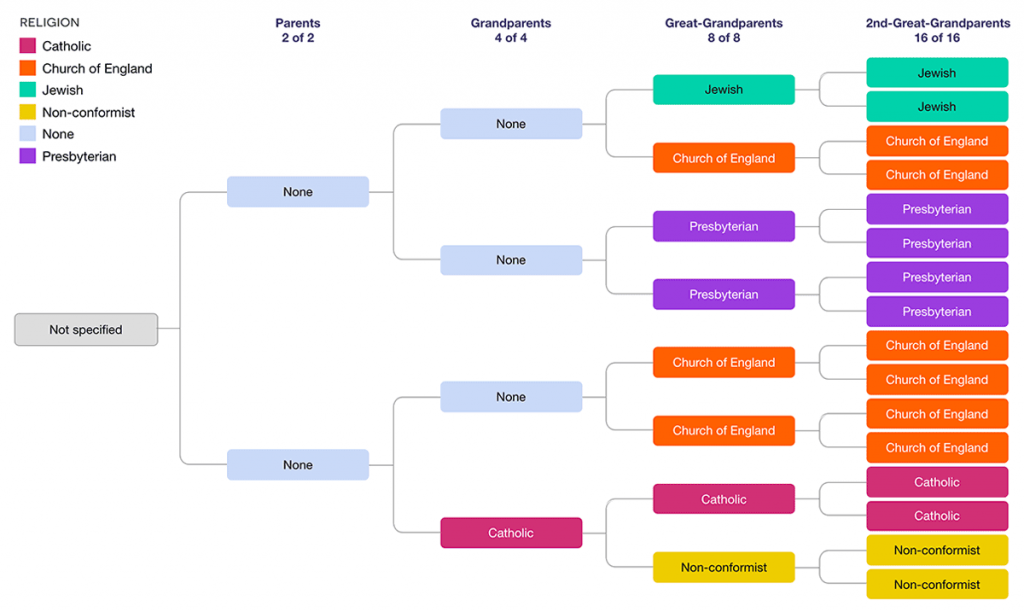
I was able to create the chart below for my son in a few minutes by editing ancestors in my tree and using the checkbox I mentioned earlier. For example, I hovered over my grandfather in the tree and clicked ‘Edit’:
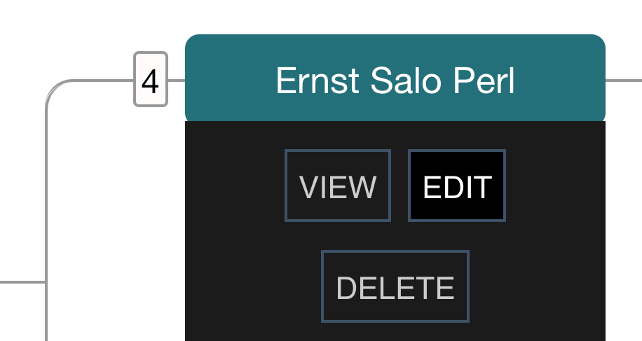
I then scrolled down the edit form to my newly created “Religion” dimension and selected “add new”. After I typed ‘Jewish’, I checked the box “Also apply to all known ancestors of this person?”

Repeating this process where applicable on other branches produced the following chart. While we can’t interview all our ancestors to discuss their beliefs, this provides a useful snapshot!
Editing dimensions
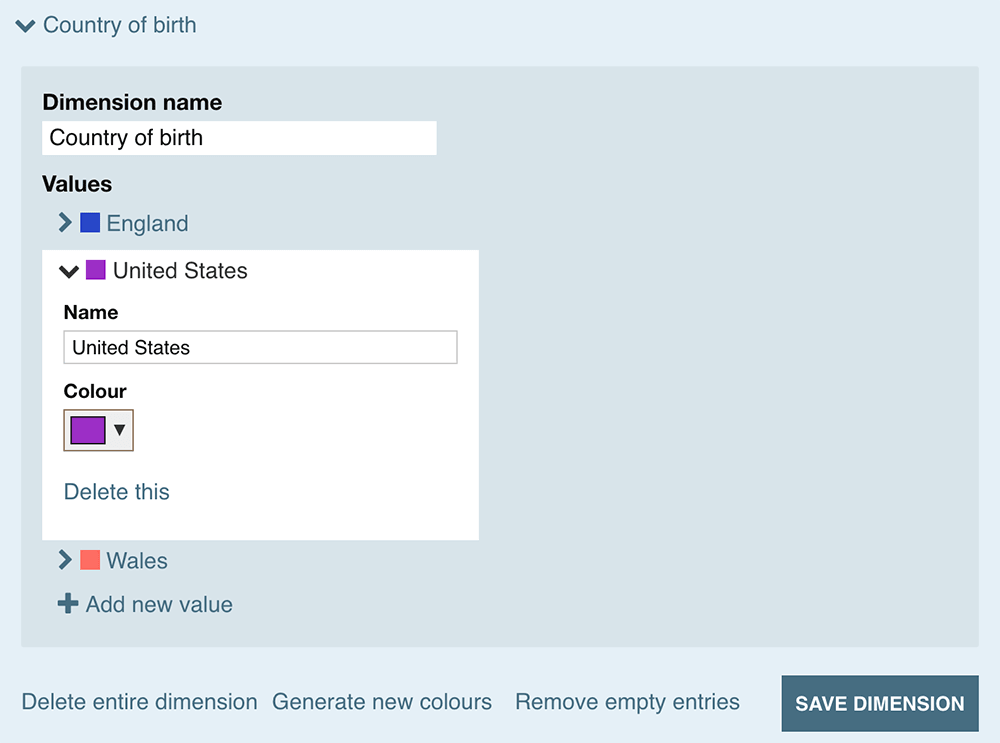
You can edit any dimension, colour or value individually via the ‘Add/edit dimensions’ overlay. There’s also a handy ‘Regenerate colours’ button that will create a new set of random colours.
Genealogy Facts
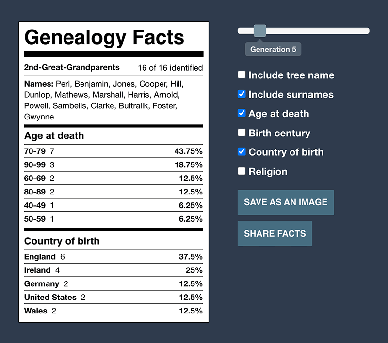
Having visualized different aspects of your tree, you can encapsulate them into a single, sharable summary of genealogy facts. You can access this via the Dimensions menus, or by clicking ‘Facts’ under the key when viewing any dimension.
Sharing DNA Painter Dimensions
Sharing is obviously completely optional, and all information you enter remains completely private by default. However, I’ve tried to make it as easy as possible to share your tree and dimensions:
- As previously, you can share your tree via the share menu. This generates a link. Anyone with this link will be able to view your tree. Living people will be hidden unless you explicitly choose to show them.
- You can also generate a link to your Genealogy Facts that you can share on Facebook or Twitter, or via downloading an image.
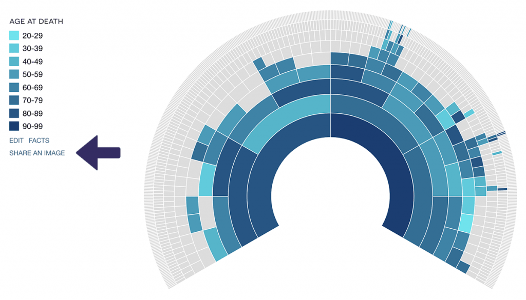
- Finally, you can do the same with the dimension view of your fan chart by clicking ‘Share an image’ under the key.
Example trees with DNA Painter Dimensions
Here are some examples you can look at:
- My son’s tree
- His searchable direct line. Living people are hidden.
- His shared Genealogy Facts page
- A simple page with some statistics about his direct line
- His shared dimension page
- Another simple view of just the ‘Country of Birth’ dimension in a fan chart.
- Charles II of Spain (an interesting example of pedigree collapse)
But the best way to get started would be to log into DNA Painter and create or edit your tree.
Beta
You’ll notice the “beta” badge on the Dimensions menu item. This was somewhat complicated to code, and it’s inevitable there will be the odd glitch. If you encounter anything unexpected, please feel free to contact me via the details at the bottom of this page.
The background to DNA Painter Dimensions
If you’re curious, I’ll explain briefly why I built this feature.
In 2015, I had the notion of assigning colours to countries of birth and putting these into a fan chart in order to produce a kind of snapshot of a person’s ancestry. I hadn’t taken a DNA test at this point, and a colourful location chart seemed to me a much more interesting and meaningful summary than some of the DNA result pie charts I’d seen floating around.
I gather I wasn’t the only one who had this idea: a popular craze along similar lines was started by J. Paul Hawthorne back in 2016
Inspired by this visualisation of a coffee flavour wheel, I created a version for myself that I called ‘The Wheel of Fun’.
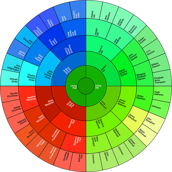
I was not active in the genealogy community at this time, so this idea barely went further than my family. But I always planned to make something similar available to others. It seems to have taken me six years. I’m pleased to finally release it and I hope you like it. My next big release will focus more on DNA and chromosome mapping.
Contact info: @dnapainter.bsky.social / jonny@dnapainter.com
