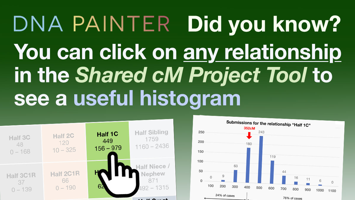
The third post in a new series aiming to surface features at DNA Painter that you might not be aware of. This time it’s Shared cM histograms…
The Shared cM Project tool is a popular interactive tool that allows you to enter an amount of shared DNA and explore relationship possibilities. The tool uses data from the Shared cM Project, a collection of crowd-sourced data that has been collated by genealogist Blaine Bettinger since 2015.
I recently had the pleasure of meeting lots of DNA Painter users at the RootsTech conference in Salt Lake City. Many people told me how much they appreciated the shared cM tool. I always asked them, “Do you also use the histograms?” In almost every case, it turned out that the user had no idea what I was talking about. So, here’s what I was talking about!
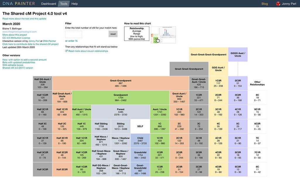
A recap on how the tool works
Near the top, you’ll see a box, ‘Enter the total number of cM for your match.’

After you enter the number of centimorgans (cMs) of DNA shared, two things happen:
- The grid of possible relationships is filtered so that just the relationships that are possible for the entered amount are highlighted
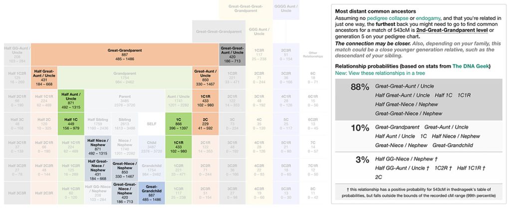
- A set of relationship probabilities are output above the grid of relationships
Shared cM Project Tool histograms
At this point, many users move onto their next task, but if you stay, you can explore possible relationships more closely:
- Click on any relationship (this could be a relationship name, or a relationship box in the grid), to view a histogram
- This is a simple graph that can give you a more detailed sense of how the amount that you share with your match compares with the amounts that other genealogists share with people with whom they share this relationship.
An example
As you can see in the screenshot above, there are quite a few possibilities for a match of 543cM.
Clearly the first thing to do is look at shared matches and investigate this match’s family history. You might then come back with a hypothesis based on ages and locations.
Let’s say that based on our research, we think this match could be a half aunt. In order to see more detail, we can view the histogram for this relationship by clicking on the text ‘Half Aunt/Uncle’ or on the Half Aunt/Uncle relationship box in the grid.
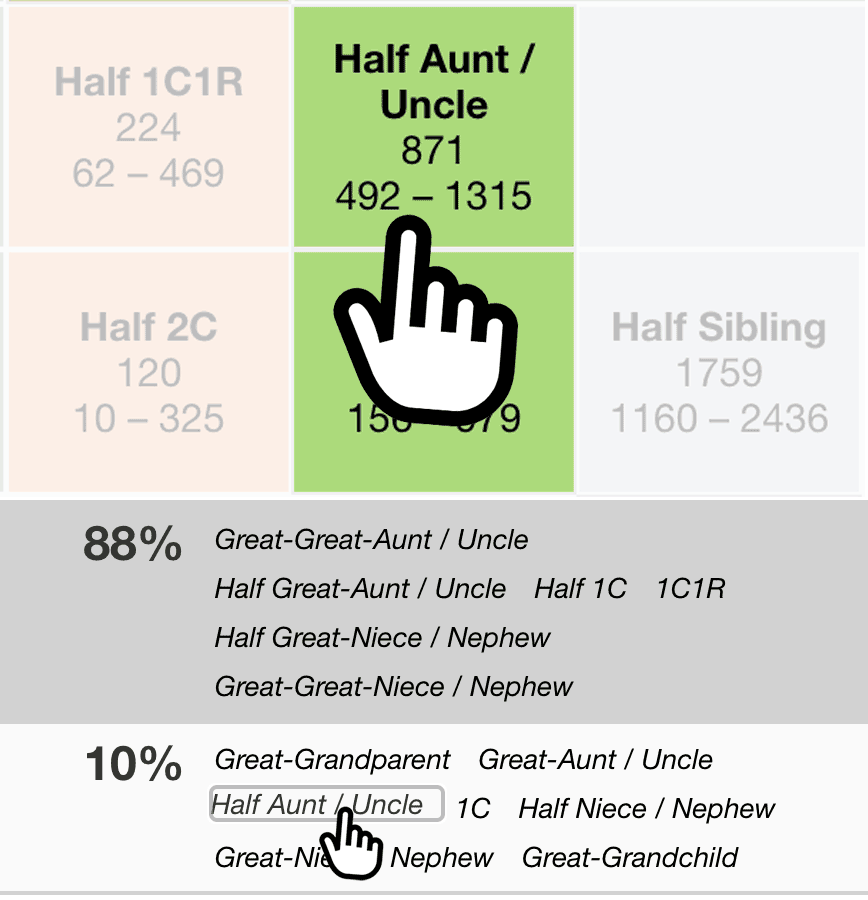
What the shared cM histograms provide
This immediately provides a lot of additional information.
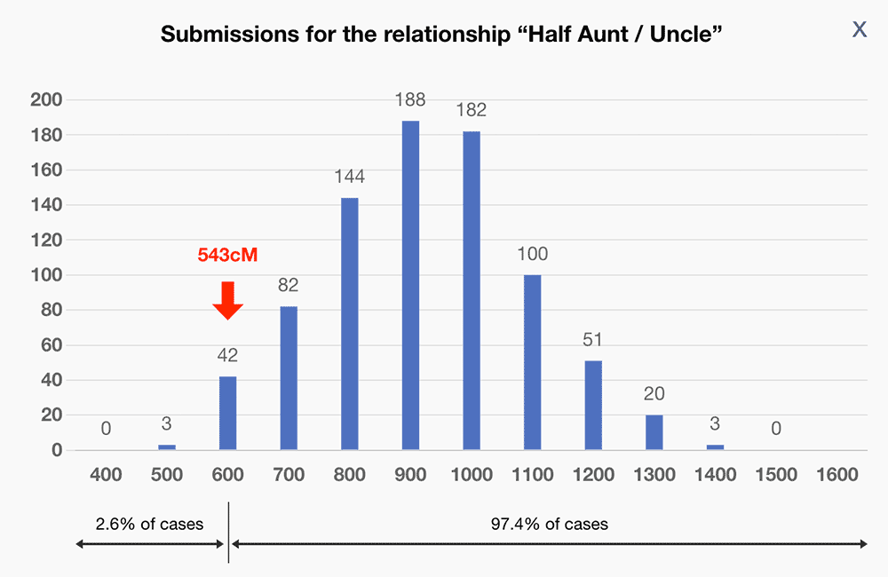
The screenshot above shows the distribution of submissions to the Shared cM Project for the relationship ‘Half Aunt / Uncle.’
We can see that while 543cM is possible for this relationship, over 97% of reported cases shared more than this. It would therefore make sense to look for additional evidence to support this hypothesis.
The information provided is as follows:
- The numbers along the X-axis represent each ‘bin’ of submissions
- For example, 600 represents all the submissions for ‘Half Aunt / Uncle’ that were between 501 and 600cM
- The numbers above the blue blocks are the number of submissions for that ‘bin’
- A red arrow indicates where the number that you’ve entered fits in alongside the other submissions
Beneath the graph you’ll see two horizontal arrows:
- One shows the approximate percentage of submissions that were less than the amount you entered (in this case, 2.6%)
- The other shows the approximate percentage that were more than the amount entered (in this case, 97.4%)
If you’re using the version of the tool that accepts two values, you’ll see a red arrow for both the amounts entered. For more information about this version, please read Blaine Bettinger’s blog post.
Additional information in the histogram overlay
Beneath the graph, the explanatory text includes data on how many submissions there were in total alongside the mean value and the standard deviation.
Finally
I hope you find the shared cM histograms useful. If so, please spread the word… After the conference, I added a small graphic to try and surface this feature more:
I hope you are now fully aware and find it useful!
Further reading
- DNA Painter Blog: Introducing the updated shared cM tool
- March 2020 update introducing the first appearance of histograms in the tool
- The Genetic Genealogist: Enhancements to the Shared cM Project at DNAPainter.com
- August 2022 post explaining the new enhanced histograms featuring the red arrow
- The Genetic Genealogist: Leveraging the Power of Siblings and Cousins to Narrow Relationship Possibilities
- November 2022 post explaining the new version of the tool that lets you enter two shared cM amounts
Contact info: @dnapainter.bsky.social / jonny@dnapainter.com